Clean, Minimalist, & Sporty Packaging

15
Created on 99designs by Vista
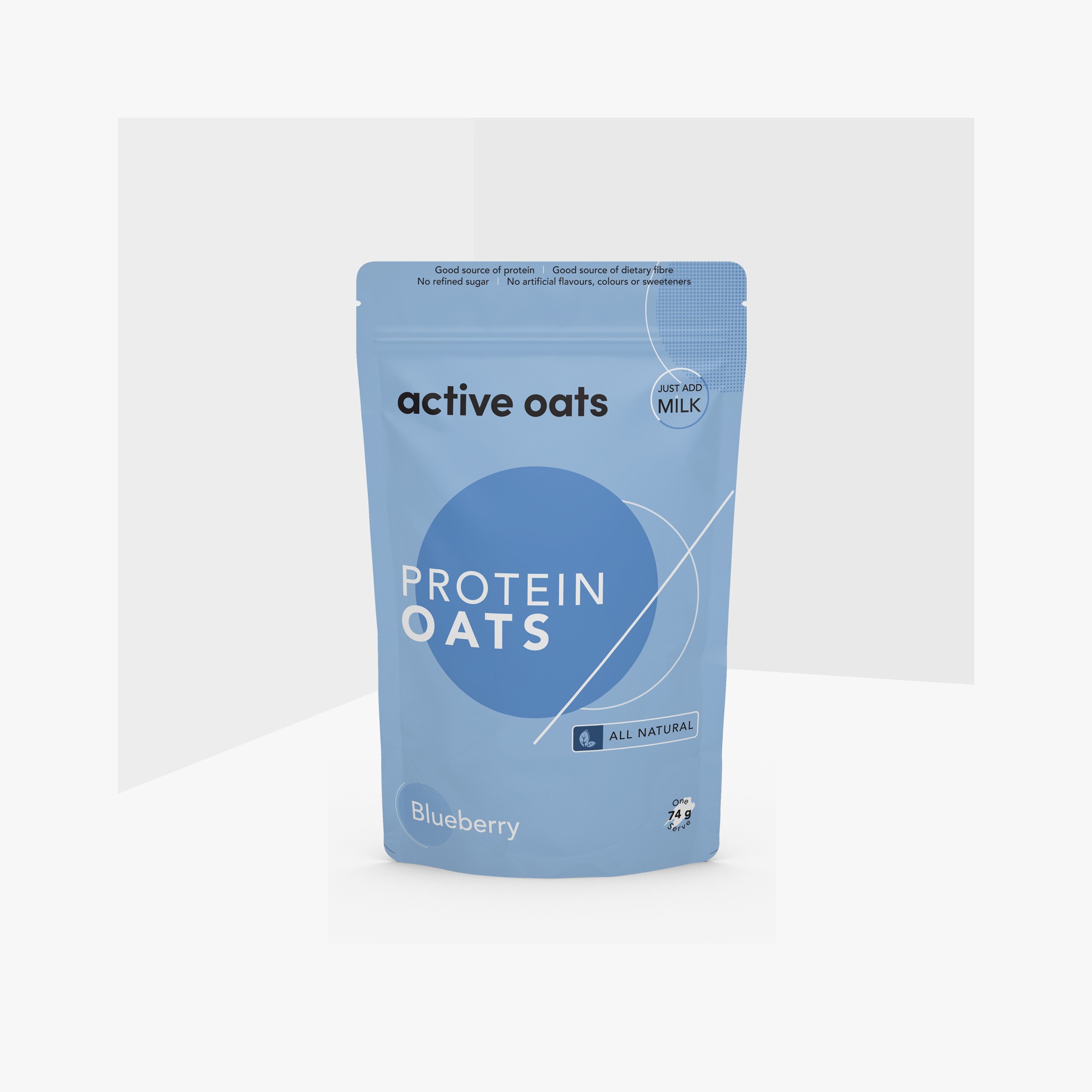
Coming from the idea that this product is Overnight, I placed a circle graphic in the center with a slash that acts as a divider between day and night. Where one solid colored side depicts night and on the other hand is just a line forming a circle (I thought that this product would be eaten in the morning, so I just gave the outline only). I put contemporary colors on the packaging, because I think basic colors are common in the market. The layout of the design follows what it needs to be displayed on the packaging so I organize it that way. This is for Blueberry flavor.