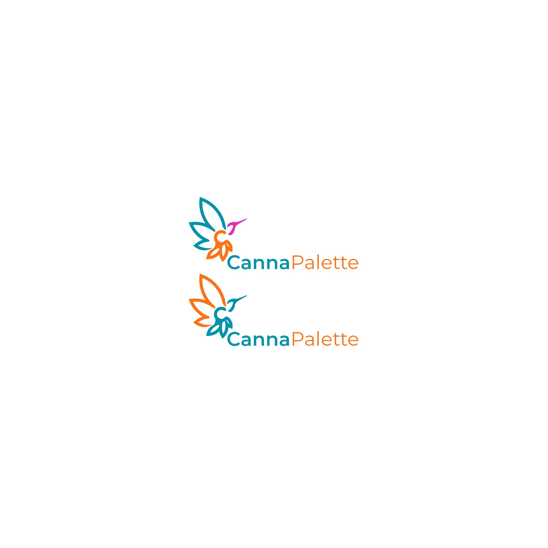

i combine Cannabis without being overtly marijuana-centric + C letter for initials + colibri bird + fly to illustrated this logo.
The philosophy of this logo is:
this is a "delivery service company". so I illustrate with a flying colibri, this represents good service from this company to its customers, besides the hummingbirds also describe the specific target market, namely marijuana flower lovers.
then all of them are incorporated into the initials letter C as the identity of this company.
iam use the colors to represent the palette.
I chose the color orange, which is optimistic, creative, stimulated, productivity, emotional expression, and enthusiasm
and I interpret this color as an emotional connection between this company and its customers. as a form of dedication,
green color means relax, refresh, and recreation.
I am always waiting for you to give feedback / comments on the designs that I have designed,
thank you:)